Who was better? Federer or Djokovic.. Nadal or Murray
ATP uses following Dashboard to compare statistics between the players
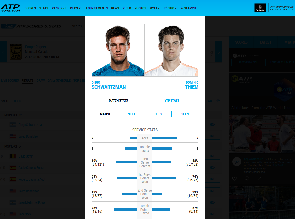
Although such a dashboard may not be the ideal way of comparing the statistics, nevertheless it is quite useful to compare many items/Stats/Features across 2 categories (Products,Players etc).
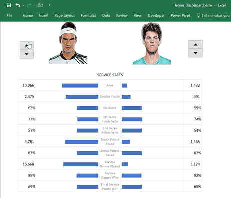
I have reproduced this Dashboard in Excel using certain techniques which I will explain in ensuing paragraphs. You can use this IDEA for example to compare 2 PRODUCTS, ENTITIES etc
Click here to Download Tennis Dashboard
TRICKS and TECHNIQUES USED
Following steps are used to create this dashboard
1.Insert pictures of the Players in Excel. Place them inside cells (You can do it manually. Also you can use my “Image Inside Cells” Add-In.
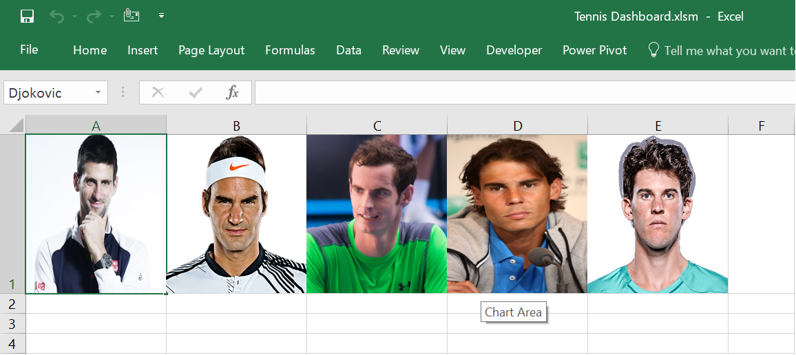
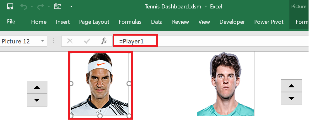
2. Name each of the above Cells by Player’s Name. In above picture, you can see Cell A1 selected and name box showing “Djokovic”
3. Create 2 linked pictures by copying one of the above cells and pasting them as Linked Pictures in the “Dashboard” sheet
4.Insert two spin buttons in Dashboard (Form Controls in “Developer” Tab)
5.Create Dynamic Named Ranges “Player1” and “Player2”
Player1=CHOOSE(Ref_player1,Djokovic,Federer,Murray,Nadal,Thiem)
Player2=CHOOSE(Ref_player2,Djokovic,Federer,Murray,Nadal,Thiem)
Ref_player1 and Ref_player2 represent Cell Links of the 2 Spin Buttons you inserted above
6. Change the formula of linked pictures to =Player1 and =Player2
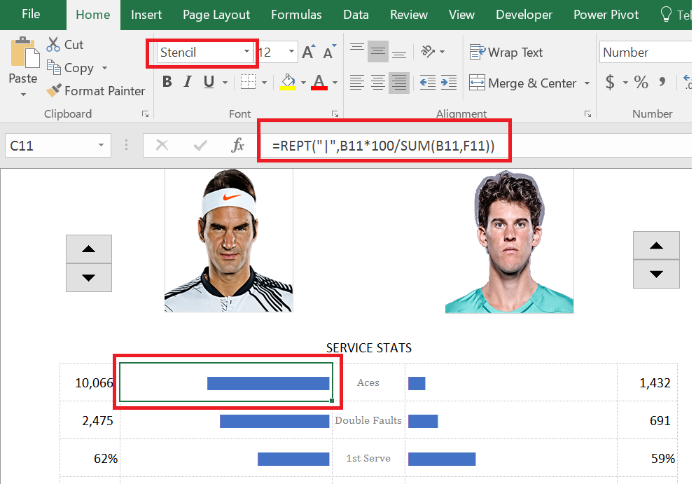
7. Use the REPT(“|”,) function and STENCIL font to emulate data bars
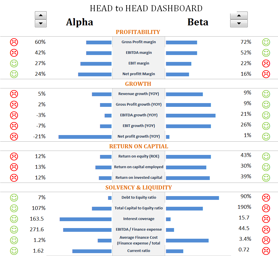
PRACTICAL APPLICATION
This Dashboard technique is quite useful when you have to compare many items across 2 Categories
You can use the above idea for example to create a HEAD 2 HEAD Dashboard comparing PRODUCTS, CUSTOMERs or ENTITIES
Following picture shows how I used this idea in one of my Dashboards.