- Download
- Overview of Beeswarm Chart
- How to Use this Visual
- Formatting Options
- Purchase of Premium Features
Download
Download the demo file here.
Download the custom visual from APPSOURCE
Overview of Beeswarm Chart
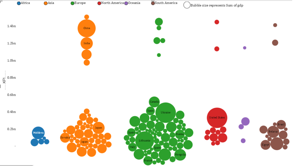
Beeswarm chart shows the distribution of data along one axis or both axes while also showing individual points. It is like a one-dimensional or two-dimensional scatter plot but with closely-packed, non-overlapping points.
How to use this Visual
The visual is intuitive and easy to follow. Only 1 field is mandatory i.e. Bee Category.
Tip: If you don’t have any category, you can simply add a calculated column with any name and use it in the category field
Bee Size field is optional and is represented in the visual by bubble area or size. If this field is missing then all bubbles will be of same size
Bee Label field is also optional. It is used to add labels to each individual bubbles.
This chart can be used in 3 ways
- Y – Axis only
- X – Axis only
- Scatter Plot (Both Y and X Axes)
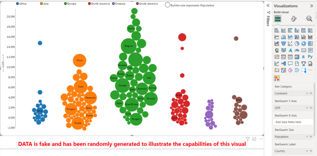
1) Y-Axis Only
As shown in picture below, if you only use a column/field in “Beeswarm Y-Axis” section while keeping “Beeswarm X-Axis” section empty, your data will be plotted on Y-Axis categorized according to the “Bee Category” section
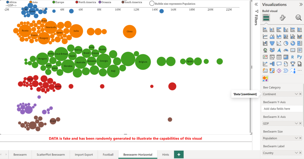
2) X-Axis Only
Similarly, if you only use a column/field in “Beeswarm X-Axis” section while keeping “Beeswarm Y-Axis” section empty, your data will be plotted on X-Axis categorized according to the “Bee Category” section
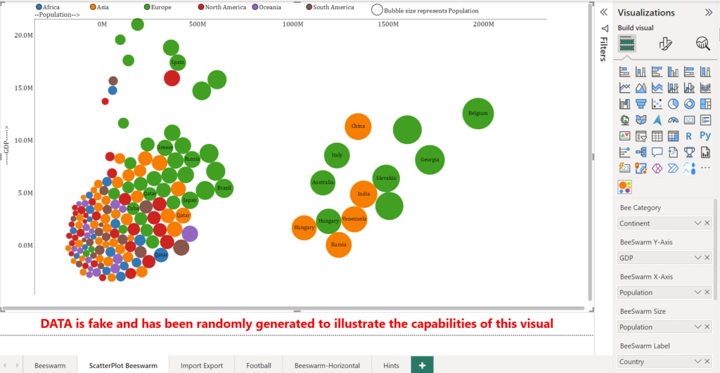
3) Scatter Plot (Both X and Y Axes)
If you use columns/fields in both sections i.e “Beeswarm X-Axis” section and “Beeswarm Y-Axis” section, the visual will work like a scatter plot with data points plotted on X-Axis and Y-axis . This is depicted below
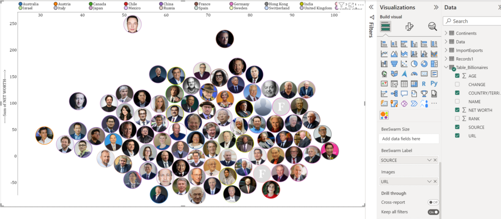
You can show images inside bubbles as well using the “Images” field. For example, the report below shows top millionaires of the world with their net worth on Y-Axis and their Age on X-Axis. Its available in demo file.
Formatting Options
These options are available in the format pane of the visual under “Settings”.
1) Bubble size
As the name implies, this setting simple increases / decrease the bubble size
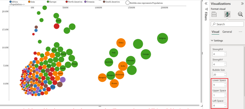
2) Lower Upper and Left Space
Beeswarm chart produces non colliding bubbles or in other words circles don’t overlap.
This can often cause bubbles do go outside the chart area especially when there is a concentration of data around minimum and maximum data values. This is where these settings are very useful to bring data inside the chart area. These settings increase or decrease the Y-Axis and X-Axis range to achieve this objective. Try adjusting these settings on the demo file’s sheet “ScatterPlot Beeswarm” to see how they work.
Purchase of Premium Features
To use the visuals without Watermark in Power BI Online, please purchase the Visuals’ license for a 1 year period. License key will be sent to your email ID. You can get the license key in next few hours.
Please contact me at zubair@excelnaccess.com or WhatsApp me on +923333225816 to get the price quoteIf you don’t hear back from me, it is most likely due to email authentication problems or SPAM filters. In that case, please leave me a message on Twitter or Linkedin or WhatsApp me on +923333225816
Have any questions or concerns? Please don’t hesitate to contact me at zubair@excelnaccess.com or WhatsApp me on +923333225816