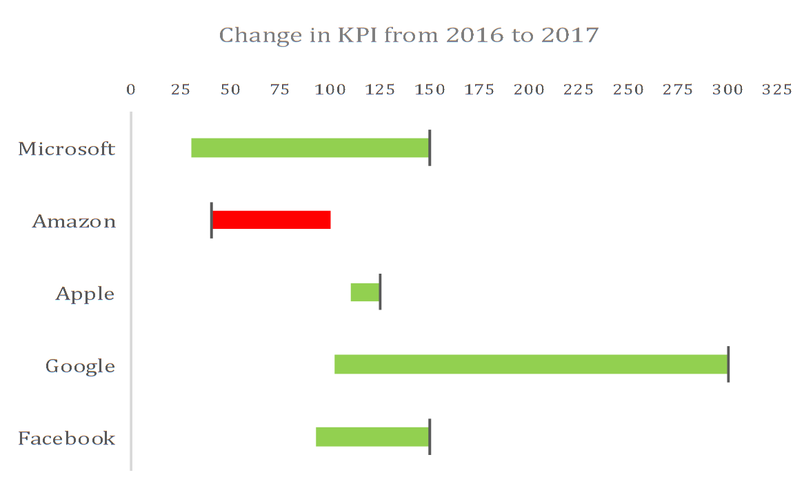
A Range Bar Chart looks like this and is very useful for displaying change between 2 points in time
I discovered this chart from Stephen Few’s article. Click here to read this article
As Few mentions in this article,
This approach does a reasonably good job of supporting two tasks simultaneously—comparing the magnitudes of values and magnitudes of change—although it does not support these tasks individually as well as some of the other approaches.
I was able to produce this Chart in Excel using certain Tricks. Click below to download the Range Bar Chart in Excel.
[download id=”1526″]
I would love to see this Chart in Excel, so I have put forward this idea in Excel’s User Voice.
Please support my idea for voting for it on the link below