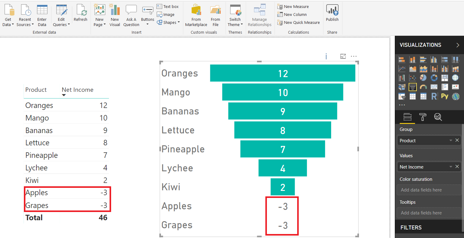
Funnel chart is a beautiful chart in Power BI but if the values for a particular Group in a funnel chart are negative they are are not depicted visually in the form of a bar
So in the example below, Apples and Grapes are not depicted visually because their Net Incomes are negative
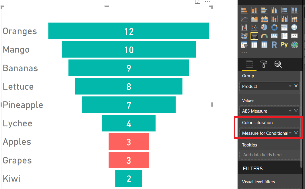
But here is a small trick to show bars for negative values and have them colored differently from positive bars
First Step is to write a MEASURE getting absolute VALUES
For example in above example
ABS Measure = ABS(sum(Table1[Net Income]))
Next step is to assign a value of 1 to all positive values and a value of 0 to all negative values using another MEASURE.
This MEASURE will then be used for conditional formatting using “COLOR SATURATION” field of the Funnel Chart.
i.e.
Measure for Conditional Formatting = If(sum(Table1[Net Income])<0,0,1)
Next step is to place this MEASURE "Measure for Conditional Formatting" in the "Color Saturation" Field of the Funnel Chart
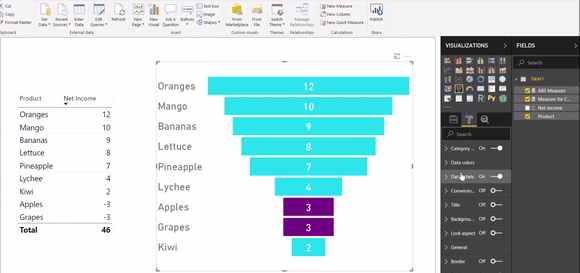
Since the MEASURE for Conditional Formatting returns only 2 values i.e. {0,1}.....you can select Funnel Chart>>> Format >>>Data Color and choose the Color for Maximum (i.e. 1) and Minimum (i.e. 0) values of the MEASURE.
Click here to download the pbix file