Column and bar charts are arguably the most commonly used charts typically used for comparing the relative size of distinct categories
Conditional formatting of these Charts could be invaluable in providing more insights about your data.
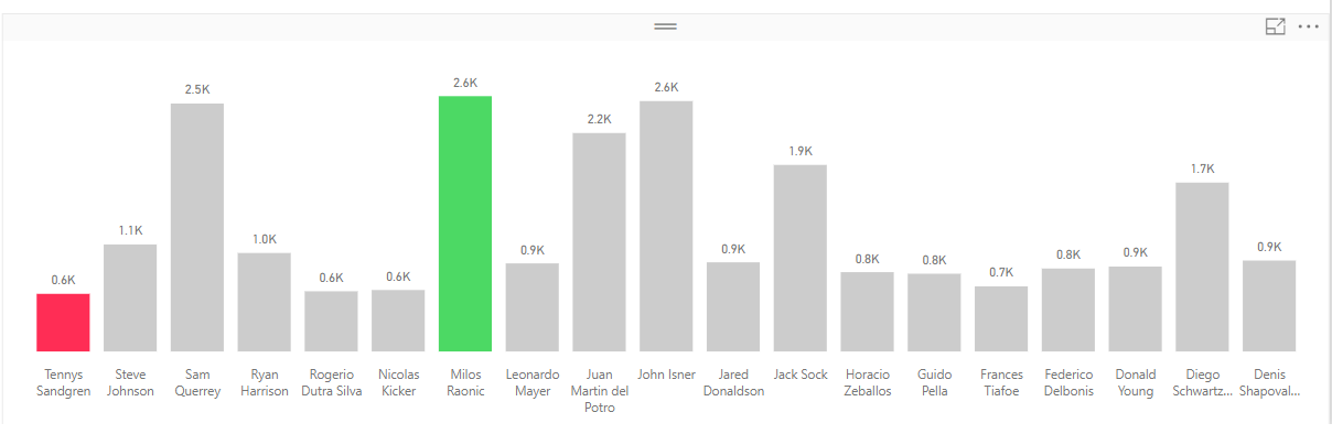
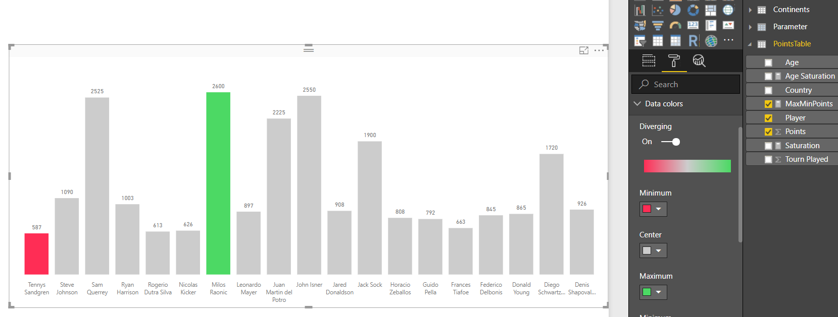
Consider the simple chart below. It shows the points earned by Top 100 tennis players in the World….The Chart is sliced/filtered by a slicer on Continents
Conditional Formatting can be applied to above chart for example to
OBJECTIVE 1: Highlight the Columns /Players with Maximum and Minimum Points
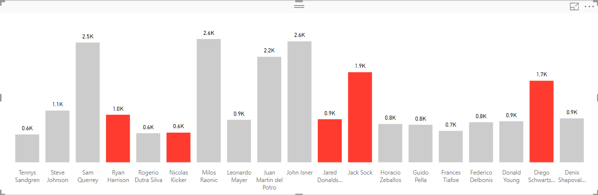
OBJECTIVE 2: Highlight Players whose age is between 20 to 25
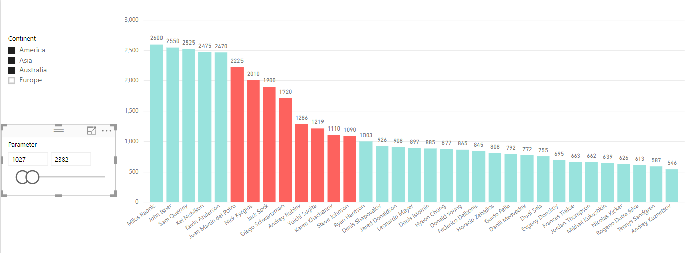
OBJECTIVE 3: Highlight Players based on Parameter Table’s Selection
HOW ?
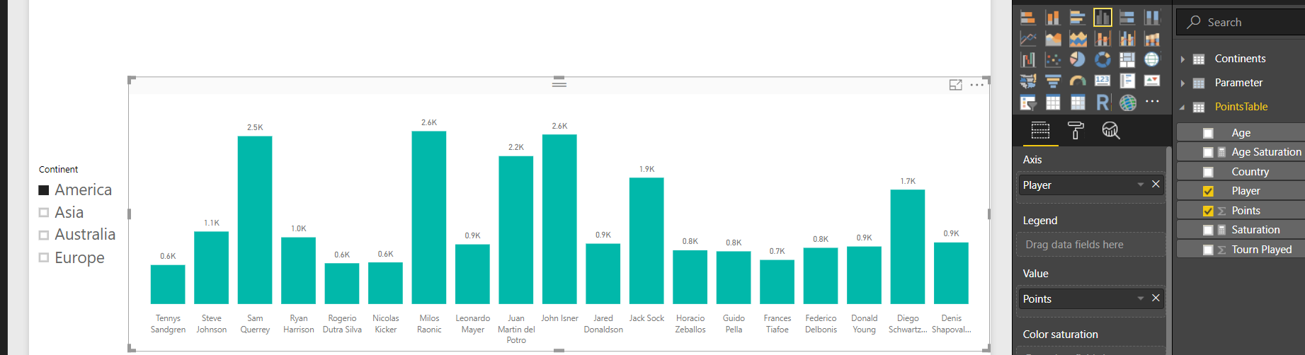
This conditional formatting is achieved by using the Color Saturation Property of the chart and by creating a MEASURE that separates the bars/columns you want to highlight from rest of the chart
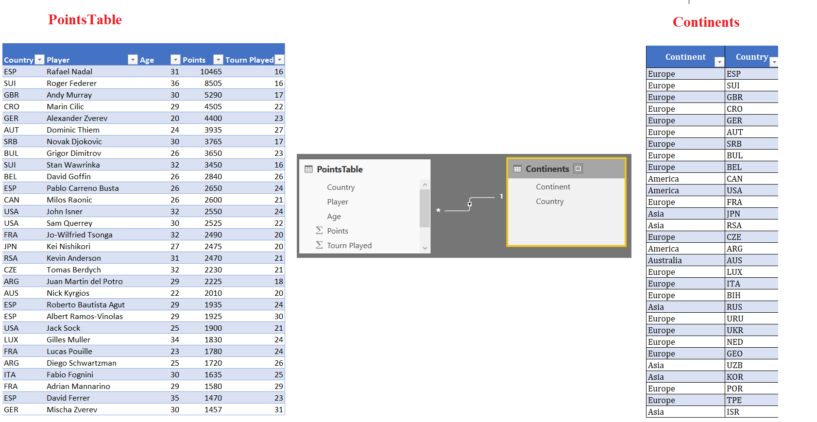
The data used for above example is as follows
Click here to download pbix file
CASE 1: Highlight the Columns /Players with Maximum and Minimum Points
In this case, we define a MEASURE as follows
MaxMinPoints =
VAR Maxpoints =
CALCULATE ( MAX ( PointsTable[Points] ), ALLSELECTED () )
VAR MinPoints =
CALCULATE ( MIN ( PointsTable[Points] ), ALLSELECTED () )
RETURN
SWITCH (
TRUE (),
SUM ( PointsTable[Points] ) = MinPoints, 0,
SUM ( PointsTable[Points] ) = MaxPoints, 2,
1
)
In short, we assign a value of 0,2,1 respectively to minimum , maximum and all other points
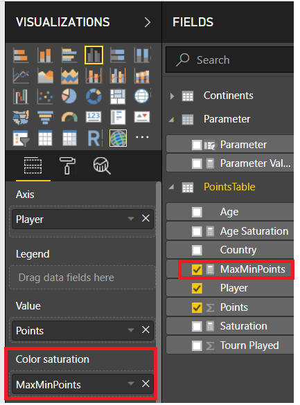
Next step is to put this MEASURE in the Color Saturation Property of the chart…then go to Format>>>Data Colors and define the Colors for the MEASURE’s values… This is shown in the image below
Similarly you can define rich MEASURES to achieve different conditional formatting objectives.
The other 2 cases as above would be easy to follow by reviewing the pbix file
Click here to download pbix file. Play with Color Saturation and MEASURES to learn. May be you discover something even more interesting 🙂