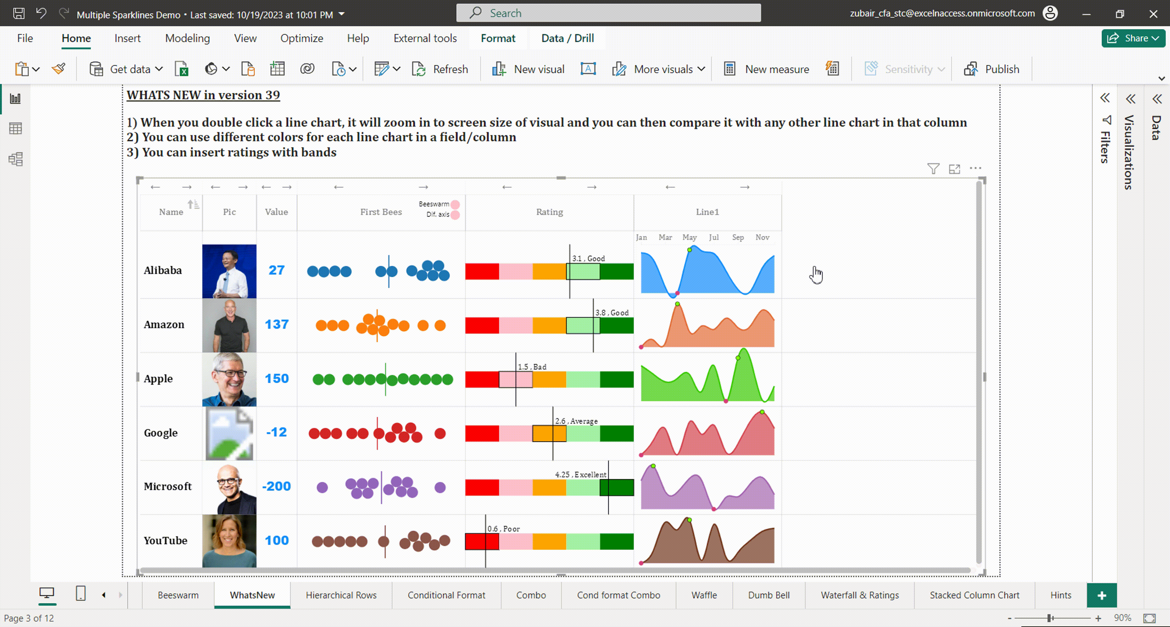
What’s new in latest version #39
CONTENTS
- Download
- Overview of Multiple Sparklines Chart
- How to Use this Visual
- Formatting Options
- Line /Area Chart
- Column Chart
- Bullet / Bar Chart
- Bubble Chart
- Donut Chart
- Normal values (text, number, image urls, web urls, UNICODES etc)
- Combo Chart (line plus column chart or double line chart)
- Dumbbell / Range Bar Graph
- Waterfall chart
- Ratings chart
- Stacked Column Chart
- Beeswarm / Breakdown bars
- Stacked Bar / Pie Chart / Vertical Bars
- Group Headings
- Purchase of Premium Features
- New Features in Version 4.0.1 of Multiple Sparklines
- Frequently Asked Questions (FAQs)
DOWNLOAD
You can download this visual from Microsoft’s AppSource. Go to Visual’s page
OVERVIEW
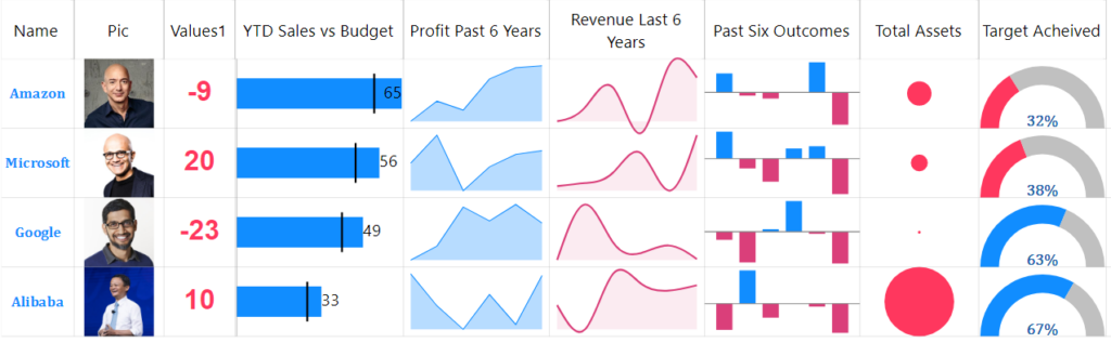
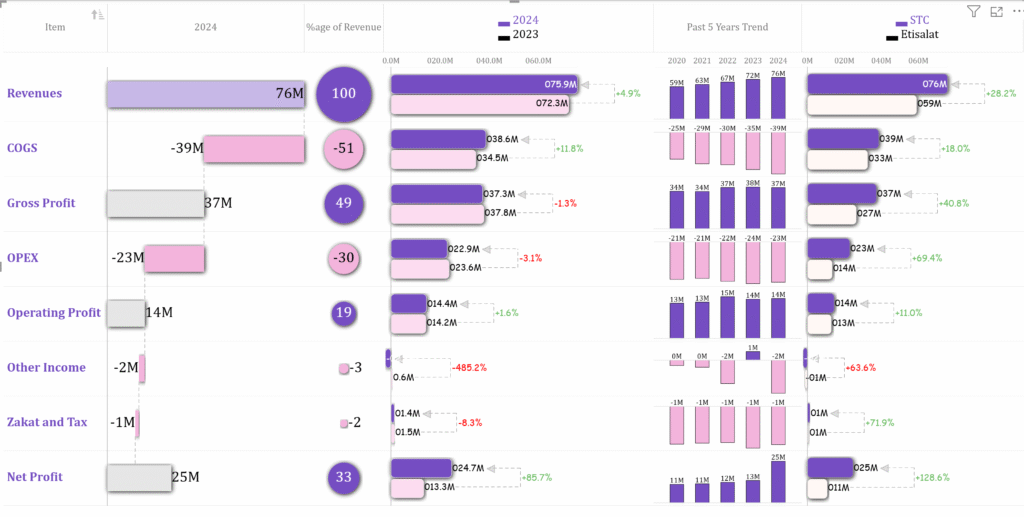
It is difficult to see trends or patterns when you are presented with a table full of rows and columns of numbers. A graph – like a picture – can be worth a thousand words when it comes to visually representing data
A sparkline (line chart, column chart etc.) is a tiny chart in a Table cell that provides a visual representation of data for a particular category
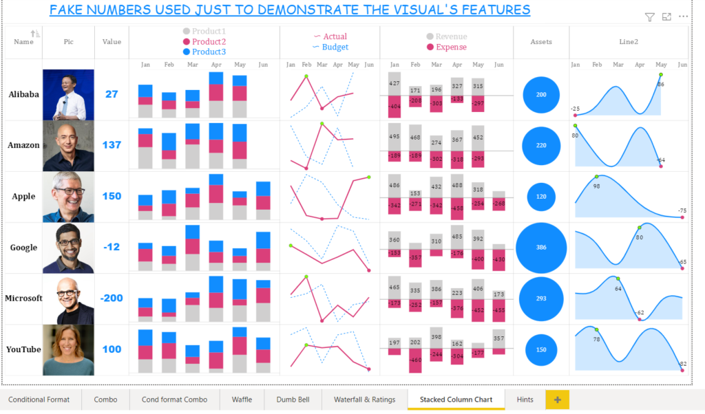
This Power BI Custom Visual transforms your Table numbers into stunning charts to give more insights into your data.. The visual supports following chart types
- Line Chart / Area Chart
- Column Chart
- Bubble Chart
- Donut Chart
- Bullet/ Bar chart
- Normal values (text, number, image urls, web urls, UNICODES etc)
- Combo Chart (Column plus Line)
- Dumbbell chart
- Waterfall
- Ratings
- Stacked Column Chart
HOW TO USE THIS VISUAL
For better understanding on how to use this visual, download the sample pbix file by clicking here
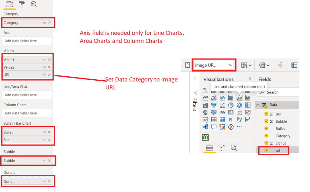
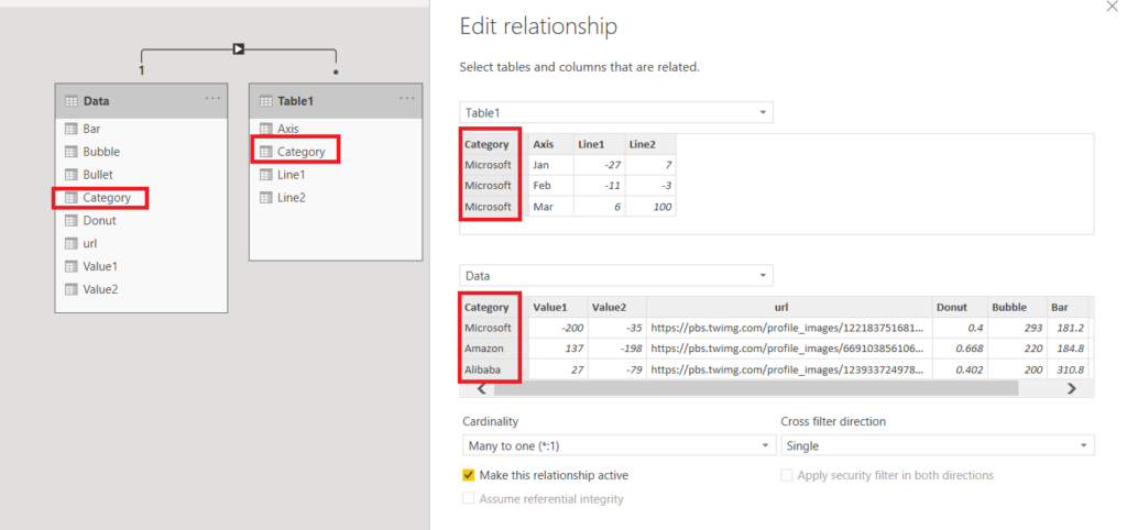
This visual requires one “Category Field”. Sparkline charts are created across each item in Category Field.
The “Axis Field” is needed for “Line Charts” and “Column Charts”
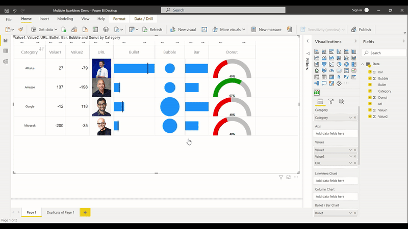
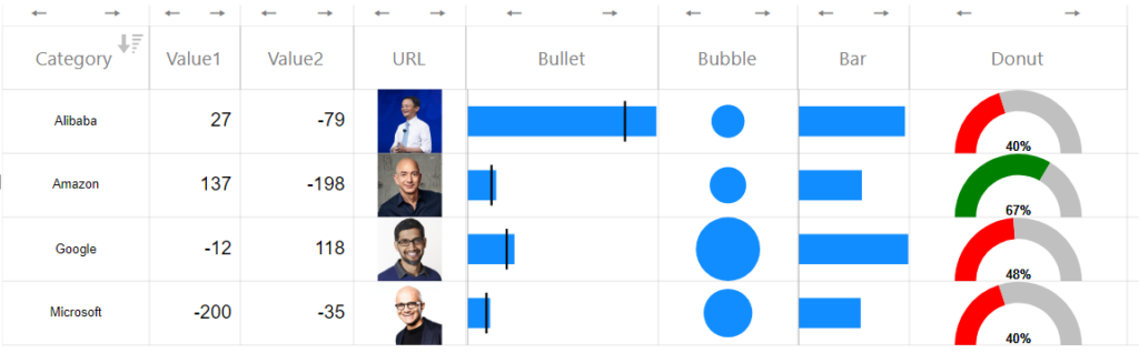
Here is simple data table without “Axis field”. Copy the data to Power BI desktop and drag the fields as shown in picture.
| Category | Value1 | Value2 | URL | Donut | Bubble | Bar | Bullet |
| Microsoft | -200 | -35 | https://pbs.twimg.com/profile_images/1221837516816306177/_Ld4un5A_400x400.jpg | 0.4 | 293 | 181.2 | 13.2|11 |
| Amazon | 137 | -198 | https://pbs.twimg.com/profile_images/669103856106668033/UF3cgUk4_400x400.jpg | 0.668 | 220 | 184.8 | 16.8|14 |
| Alibaba | 27 | -79 | https://pbs.twimg.com/profile_images/1239337249788985344/kCtYRfmZ_400x400.jpg | 0.402 | 200 | 310.8 | 111.6|93 |
| -12 | 118 | https://pbs.twimg.com/profile_images/864282616597405701/M-FEJMZ0_400x400.jpg | 0.475 | 386 | 320.4 | 27.6|23 |
You should see a visual like below
RESIZE COLUMN WIDTH and ROW HEIGHT by holding and dragging mouse
You can hold and drag vertical gridlines to resize column width and horizontal gridlines to resize row height
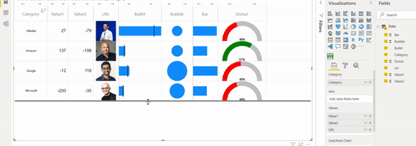
REARRANGE /MOVE THE CHARTS/COLUMN FIELDS
To rearrange the charts/column fields, use the arrows on top of each Column. This is depicted below
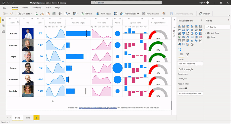
To add line chart and column chart we need axis field. Lets add another table (Many side table) linked to above table by “Category Field”
| Category | Axis | Line1 | Line2 |
| Microsoft | Jan | -27 | 7 |
| Microsoft | Feb | -11 | -3 |
| Microsoft | Mar | 6 | 100 |
| Microsoft | Apr | -87 | 79 |
| Microsoft | May | -15 | 69 |
| Microsoft | Jun | 65 | 87 |
| Amazon | Jan | -98 | -62 |
| Amazon | Feb | -27 | 3 |
| Amazon | Mar | 56 | 19 |
| Amazon | Apr | -42 | 91 |
| Amazon | May | -83 | 79 |
| Alibaba | Jan | -10 | -80 |
| Alibaba | Feb | 49 | -43 |
| Alibaba | Mar | -94 | -60 |
| Alibaba | Apr | -51 | 30 |
| Alibaba | May | 84 | -99 |
| Jan | 14 | 44 | |
| Feb | 89 | -2 | |
| Mar | 1 | -61 | |
| Apr | 95 | -66 | |
| May | 17 | -49 | |
| Jun | -78 | -69 |
Link the 2 tables using the category field
Now you drag and drop the Axis and Line Columns from the Many side table to get Line Chart and Column Charts in Cells. This is depicted below
FORMATTING OPTIONS
In this section we will cover each individual chart’s requirements and formatting options in depth
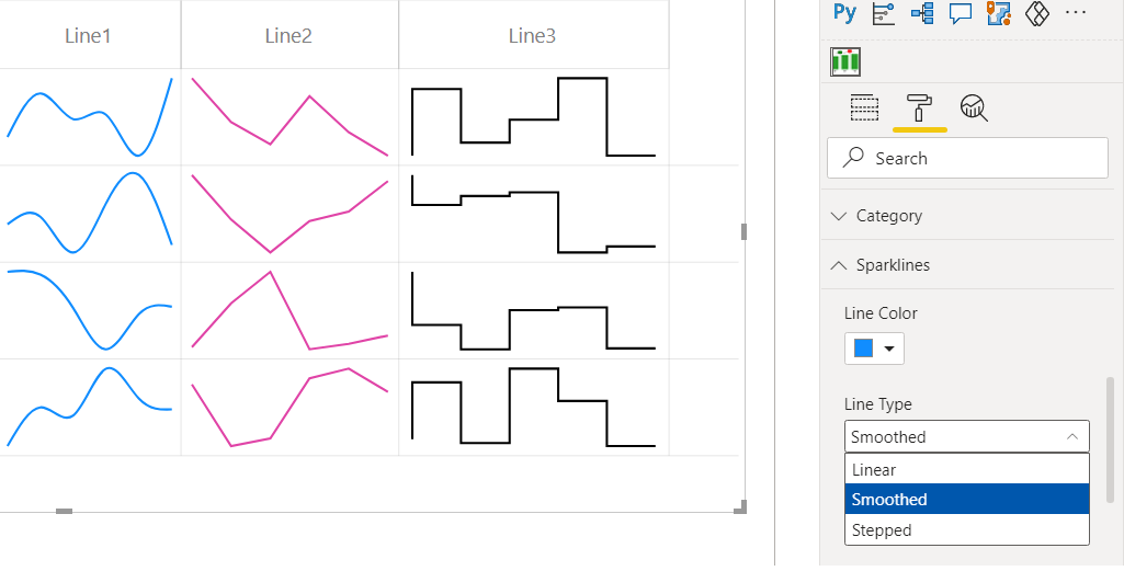
a) Line / Area Chart
You can add as many line charts as you like and format them from Formatting pane>>Sparklines
1. Line Color and Line Type
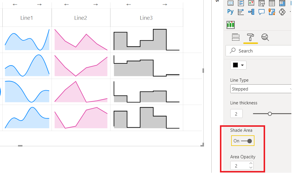
2. Line thickness
3. Shade area and Area Opacity
This converts line chart to Area Chart
4. Add data labels
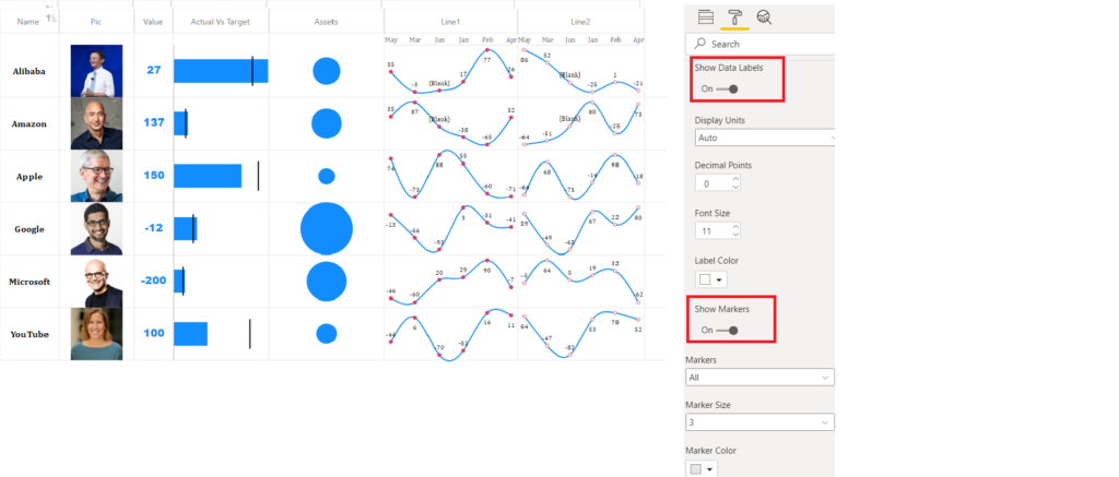
5. Show markers
6. Add vertical and horizontal padding to line charts
7. Add Reference line
With line charts, you can add a reference line(average of values, first value, last value , zero). Also you can conditionally format the line area above or below reference line
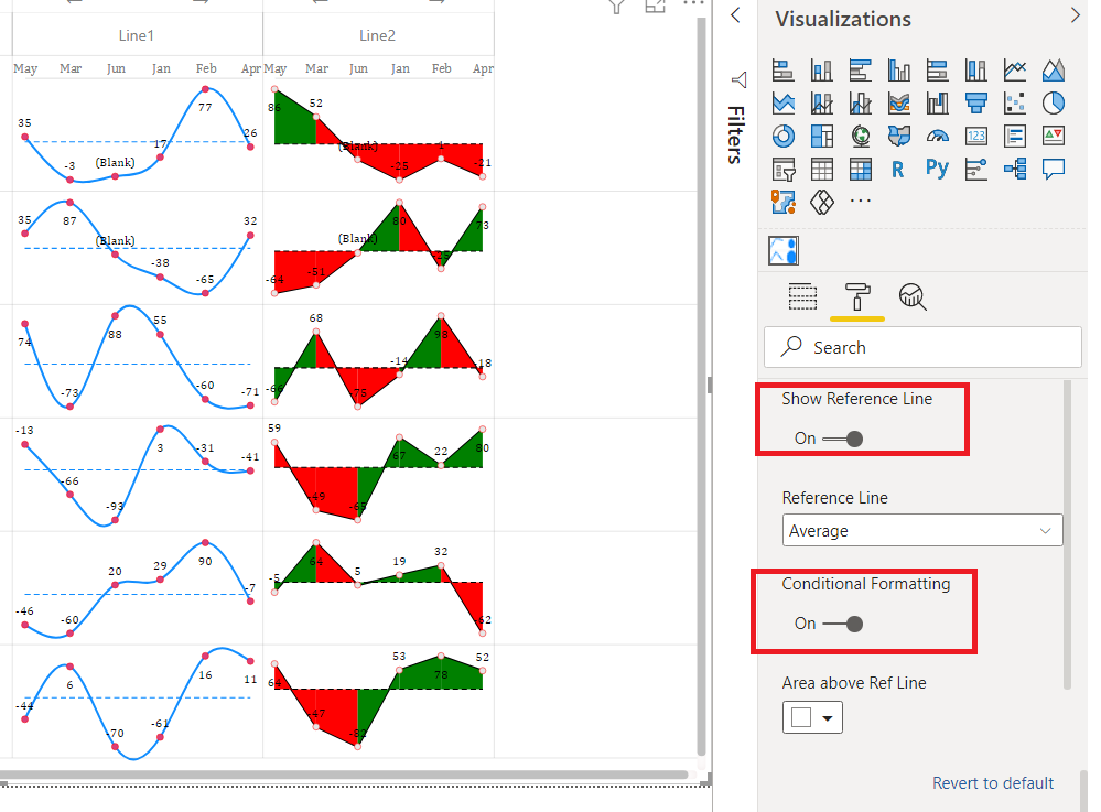
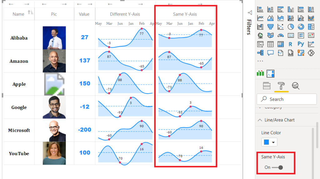
8. Same Y-Axis
By default, each line chart in a cell has its own Y-Axis. You can turn on the same Y-Axis option, if you want to have same Y-Axis for all the sparklines in a Column/ Field.
When your objective is primarily to display patterns and trends, it is recommended to turn off the Same-Y Axis option. However if you are interested in displaying the magnitude across categories, this option should be turned on
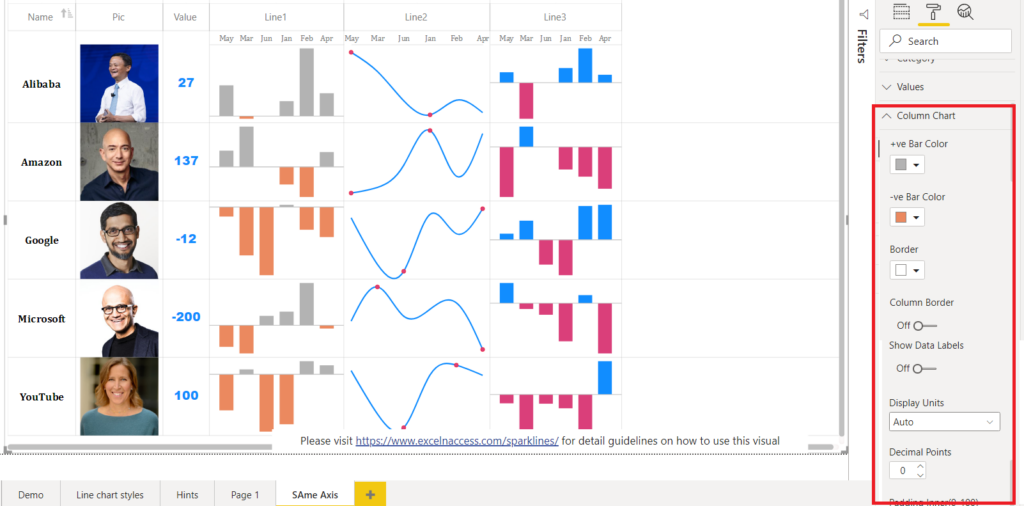
b) COLUMN CHART
Column Chart features are quite similar to Line Chart explained above. Please see demo pbix file for illustration
You can apply following formattings to a Column Chart
- Bar Color for positive and negative bars
- Border
- Data Labels
- Padding
- etc
Its pretty intuitive, so please try it out
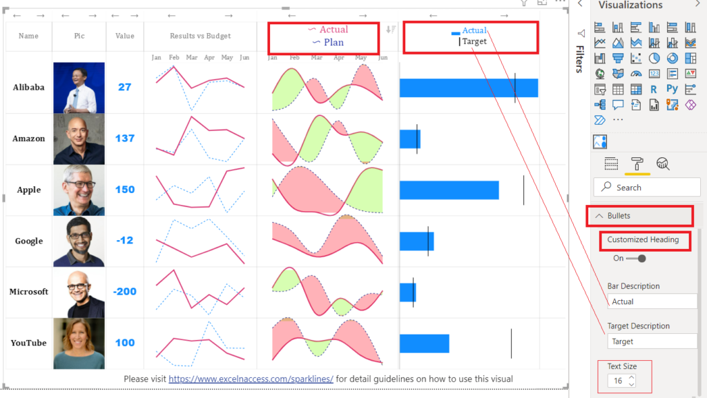
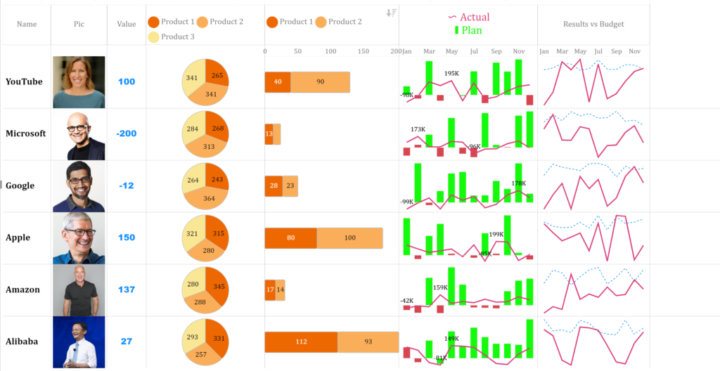
c) BULLET / BAR CHART
You can create a simple bullet chart showing a bar and a vertical line as target. You need to have 2 columns (bar values and target values) against each category.
Now add a calculated column as “Bullet=[bar column]&”|”&[target column] and drop this calculated column to Bullet/Bar field. Please see the demo pbix file to see how it works.
You can add data labels, change colors, padding etc from the formatting pane
You can also do conditional formatting of the Bullet chart to show the variance between Bar and Target. This is depicted below.
To create a simple bar chart (without target), simple drag any number data column to this section.
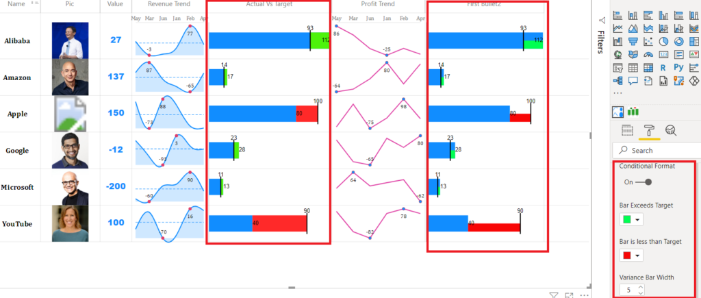
Starting from version 11.0.0.0, you can add customized heading for your bullet chart as shown in the picture below
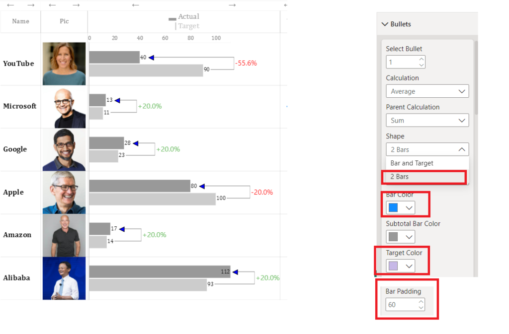
A new bullet style was added in Sep 2024. Now you can show the bullet as 2 bars with variance between them. Just choose the appropriate option from format pane in Bullets section. Try adjusting the Bar color, target color, bar padding to make it aesthetically pleasing.
d) BUBBLE CHART
Details will be added in the webpage soon. Please see demo pbix file for illustration
e) DONUT CHART
Details will be added in the webpage soon. Please see demo pbix file for illustration
f) VALUES/TEXT/IMAGE URL/WEB URL
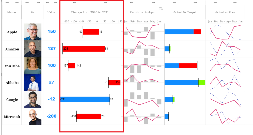
Dumbbell or Range Bar Graph is useful for illustrating change and comparing the distance between two groups of data points. You can create this chart just like a bullet chart. You need to have 2 columns (start values and end values) against each category.
Now add a calculated column as “[start values]+”|”+[end values] and drop this calculated column to Dumbbell field. Please see the demo pbix file to see how it works. See the formatting options in the format pane
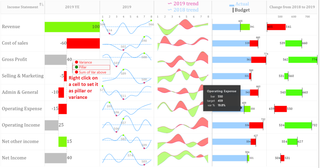
h) Waterfall chart
Starting from version 11, this visual allows you to insert a vertical waterfall sparkline. You can set a bar as “pillar“ or “variance” by right clicking the cell. This is shown in the image below. Please also see demo file for illustration.
i) Ratings chart
Starting from version 11, you can insert star ratings in cells using “Ratings chart” field.
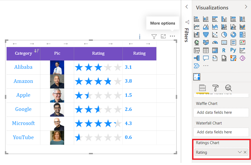
More details will be added in the webpage soon. Please see demo pbix file for illustration
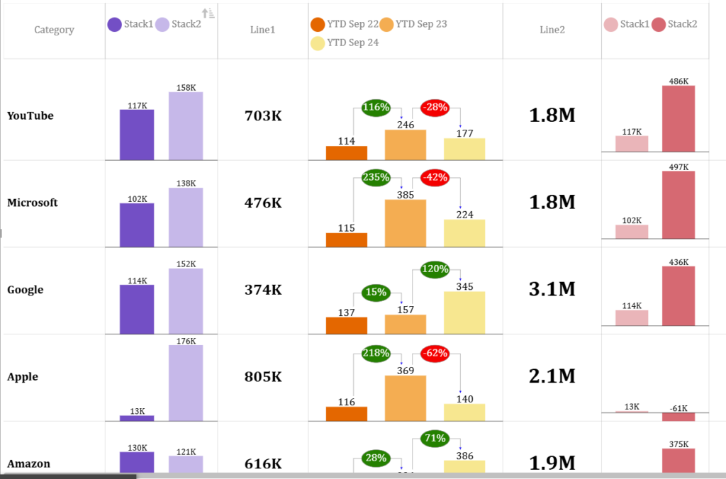
j) Stacked Column Chart
Please see the demo file to learn how to create this micro chart.
You can create up to 3 stacks for each chart
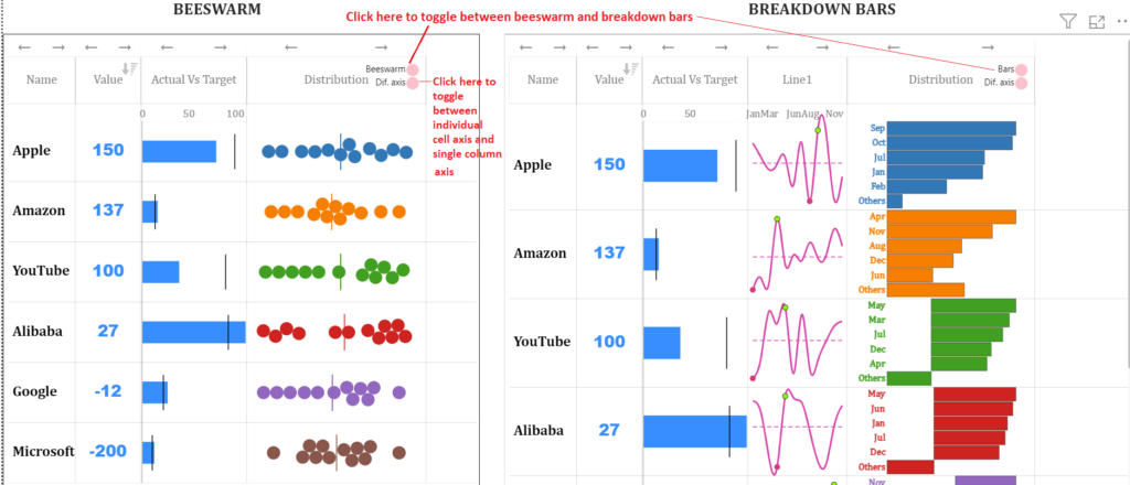
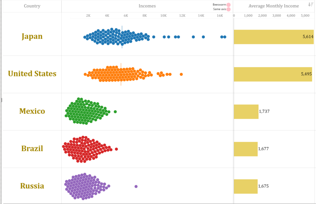
k) Beeswarm / Breakdown Bars
I felt so excited to add this chart in version 32 of the visual. Please see the demo file to learn how to create this micro chart. This microchart helps you see the distribution or breakdown of your data. You can toggle between beeswarm and Breakdown chart types as shown in the picture. Also you can toggle the axis type.
The advantage of beeswarm over breakdown bars is that it will show you all data points whilst the advantage of breakdown bars is that you can add text labels for each bar.
You need to concatenate values and/ or labels to use this chart. Ideally, the concatenated values should be created on the table on the one side of the “many to one” relationship. i.e. the table with unique values for category.
This microchart doesnot currently work with hierarchy. i.e. there should be one field in the category section.
If you face problem in using this chart, please email me at zubair@excelnaccess.com. If you send sample file with data, it will be more convenient for me to help 🙂
Values can easily be concatenated using Concatenatex dax function. Please see the demo pbix file below for illustration
l) Stacked Bar Chart / Pie Chart / Vertical Bar Chart
You can add a stacked bar chart or a pie chart by concatenating values representing stacks or pie portions.
Now you can add vertical bars with and without variance (upto six bars). This will be available from v-64 hopefully by 4-5 Dec 2024. This can be used to show breakdowns or even trends when your x-axis is not numerical. The picture below depicts the use of vertical bars.
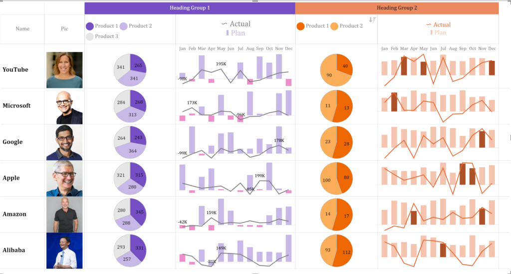
m) Group Headings
You can group similar headings. Go to format pane>>show groupings. Now give same Group Heading names to adjacent columns which you want to group.
PURCHASE PREMIUM VERSION
To use the visuals without Watermark in Power BI Online, please purchase the Visuals’ license for a 1 year period. License key will be sent to your email ID. You can get the license key in next few hours.
If you don’t hear back from me, it is most likely due to email authentication problems or SPAM filters. In that case, please leave me a message on Twitter or Linkedin or WhatsApp me on +923333225816
LIMITED TIME OFFER
If you purchase license for unlimited users, you can get entire suite of 5 visuals for no additional cost. Also license period will be increased by 6 months for no additional cost
Have any questions or concerns? Please don’t hesitate to contact me at zubair@excelnaccess.com or WhatsApp me on +923333225816
New Features in Version 4.0.1 of Multiple Sparklines
Now you can add a line plus column chart or a double line chart as a sparkline
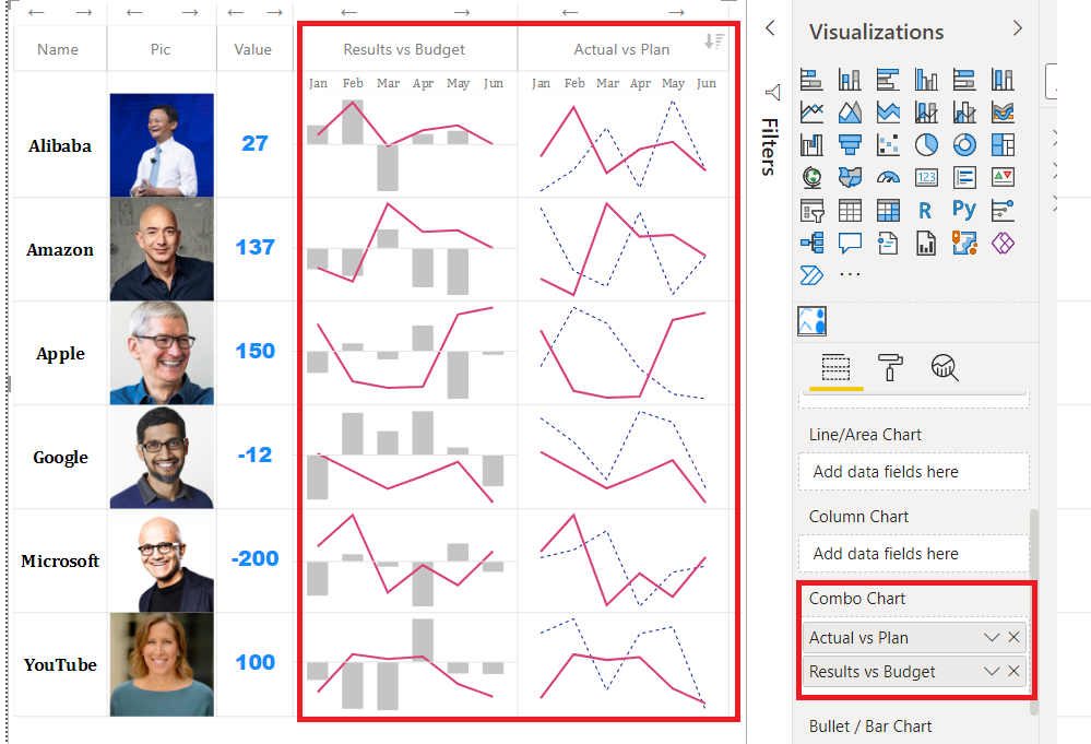
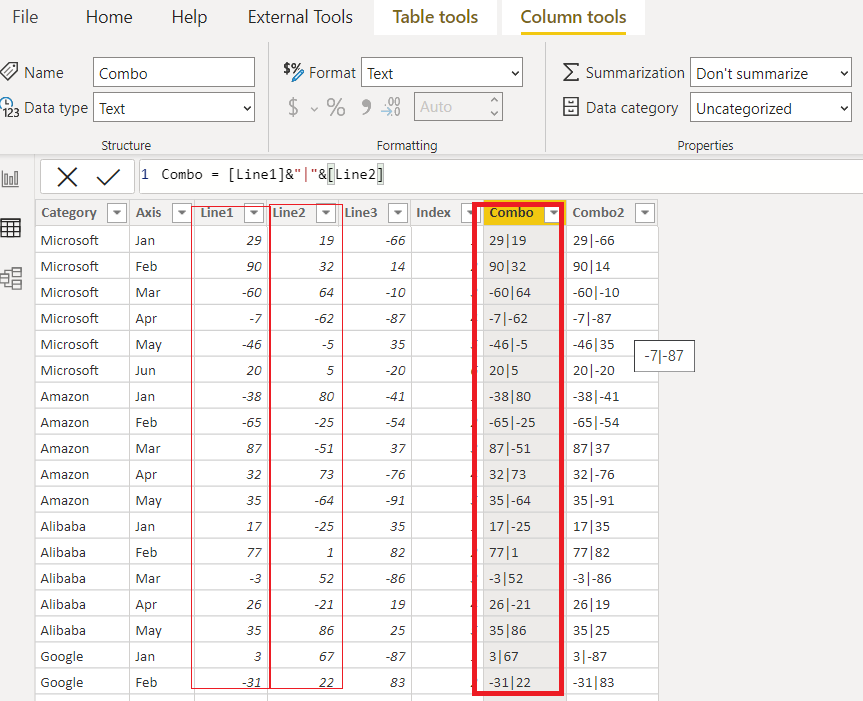
Simply create a calculated column or a measure by combining 2 separate fields and drop it to the Combo Chart field. This is shown below. Please see the demo pbix file for illustration.
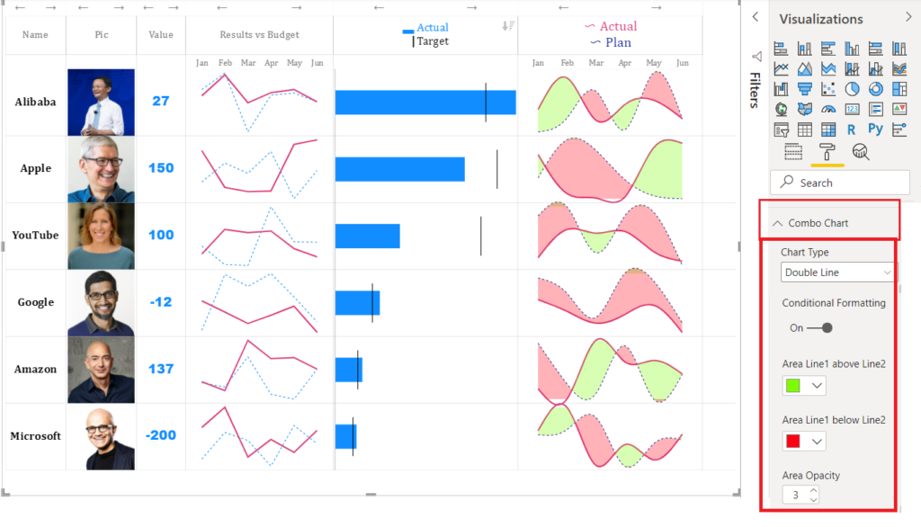
Starting from version 11.0.0.0 you can color the area between 2 line charts “Hills and Valleys” Effect.
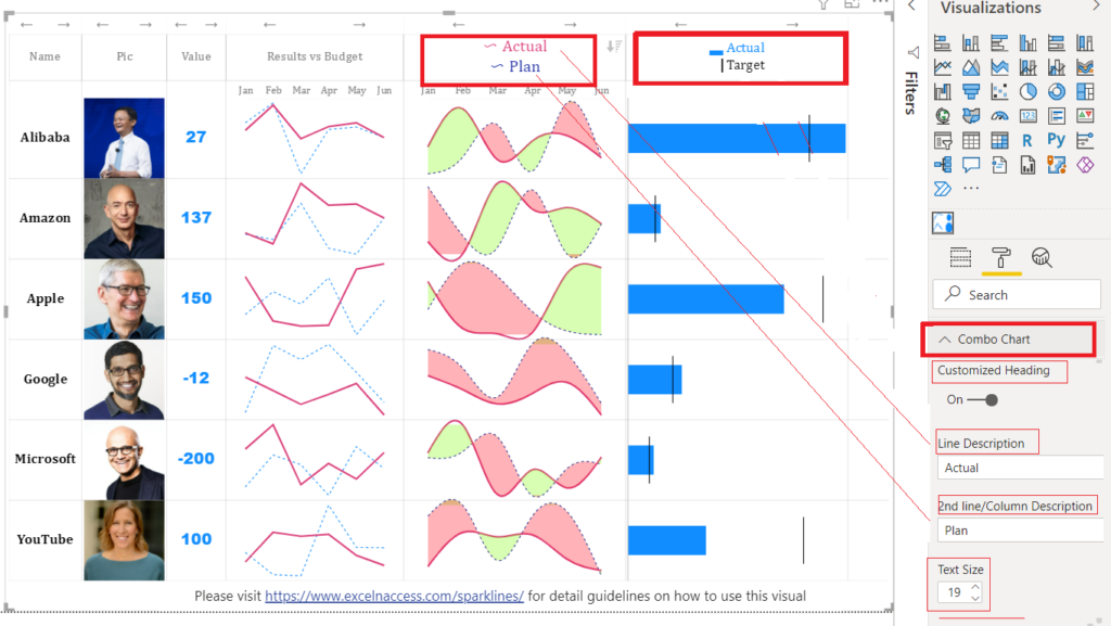
Also you can add a customized heading for combo chart just like bullet chart as shown in pic below
2. Global Y axis
Now you can choose Global Y Axis for trend charts like Line, Column and Combo Charts etc.
FREQUENTLY ASKED QUESTIONS
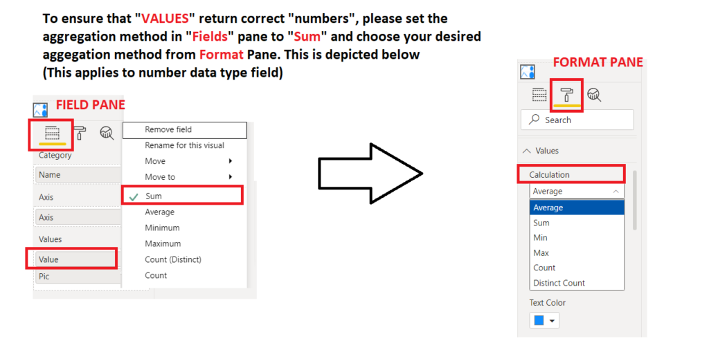
1) Why is my measure not returning correct value? The value appears to be AVERAGE of all AXIS values rather than SUM or vice versa
Answer: Please set the aggregation method in “FORMAT” pane instead of “FIELDS” pane for all sections which do not require AXIS field such as VALUES, DONUTS, BULLETS, BUBBLE, WAFFLE etc. This is depicted below
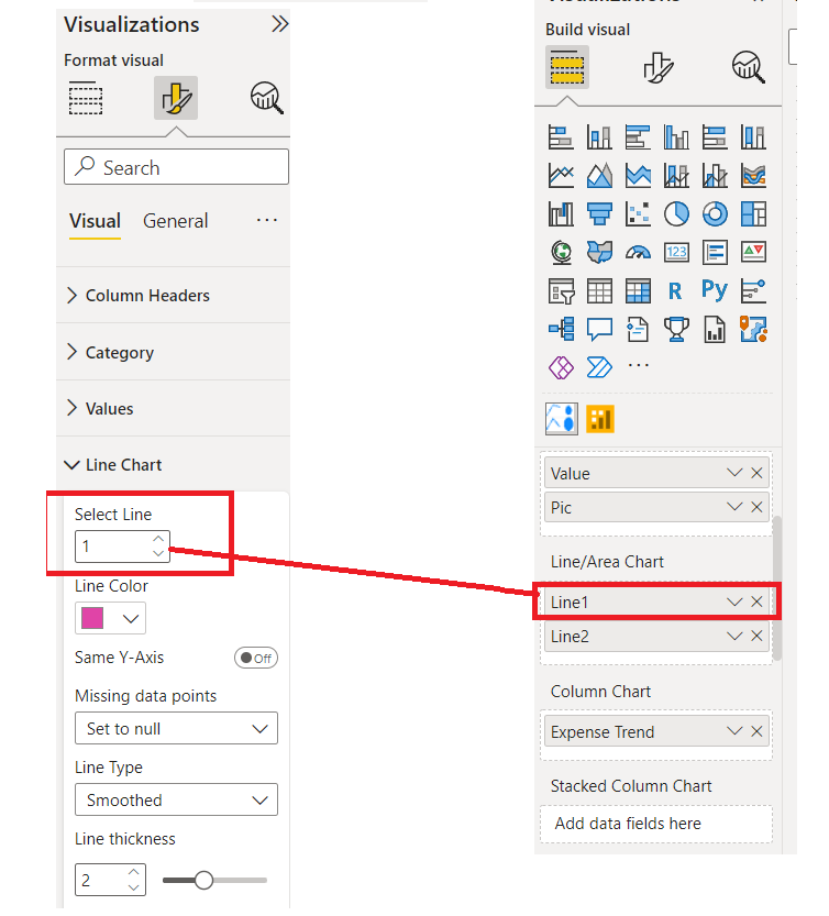
2) How can I format multiple micro charts of same type differently. For example color each line chart differently
Answer: For each micro chart, there is an option in formatting pane to select the chart to apply formatting to. For example, in the image below, the formatting will be applied to first line chart in the Fields Section
3) How can I resize heading row ?
Answer: Simply by holding and dragging it from the bottom just like you do it for normal rows
If you have any questions you can reach me by sending an email at zubair@excelnaccess.com
If you have any constructive feedback, new ideas or have found bugs in the visual, please let me know. I would be so grateful to you