Create Interactive Pivot Charts in less than 30 seconds from your Excel Table
If you regularly use pivot tables for analysis, this smart Addin would be a valuable addition to your toolkit.
This Addin transforms your excel tables/tabular data into interconnected and interactive charts/fields. The charts will effectively function like slicers i.e once you click any bar or slice in the chart, all other charts would react to your selection.
In other words, this tool lets you visualize how the various fields of your excel table/tabular data interact with each other. The illustrative example given below would make it clear
Download
Please provide name and email to download this Addin
[email-download download_id=”527″ contact_form_id= “566”]
ILLUSTRATIVE EXAMPLE ON HOW TO USE THIS ADDIN
In this example, the ZAddin is used to create interactive charts for data of top 10 highest paid athletes in the world for the past 5 years from 2009 to 2013. Earnings totals include salary, winnings, endorsements and appearance fees.
Please download the file ” TopPaidSportsmen.xlsm” from link below
[download id=”532″]
1) Installing the Addin
After downloading and saving the 2 files above i.e. “ZAddin.xlam” and “TopPaidSportsmen.xlsm”
Open “TopPaidSportsmen.xlsm”. Press ALT + T + I to open the Addin Manager. Browse for the file and enable the Addin
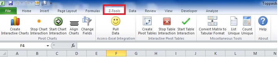
Once installed you will see a new tab “Z-Tools” in your excel workbook. Activate the “Z-Tool” Tab and you should see the items as shown below
2) Creating Interactive Charts
Select the Sheet “Source Data” in the Excel file “TopPaidSportsmen.xlsm”.
Select any cell in the tabular data. Activate the “Z-Tools” Tab and Press “Interactive Charts”.
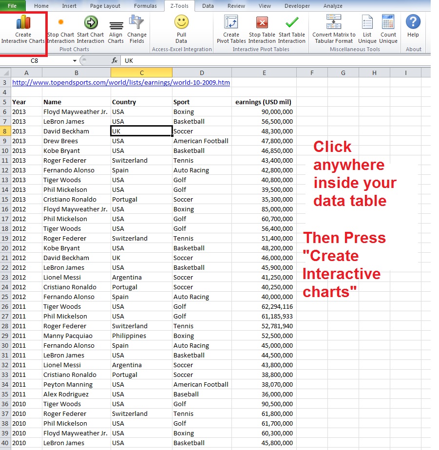
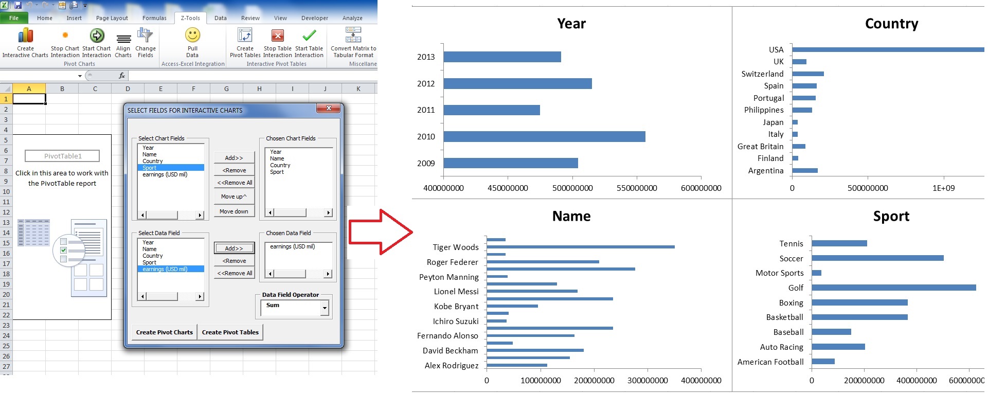
Press the “Create Interactive Charts” button. You would see a dialog form as shown below. Choose the Categories/fields which you want to analyze. These are similar to row fields of Pivot Tables. Then Choose one Data Field. Press Done.
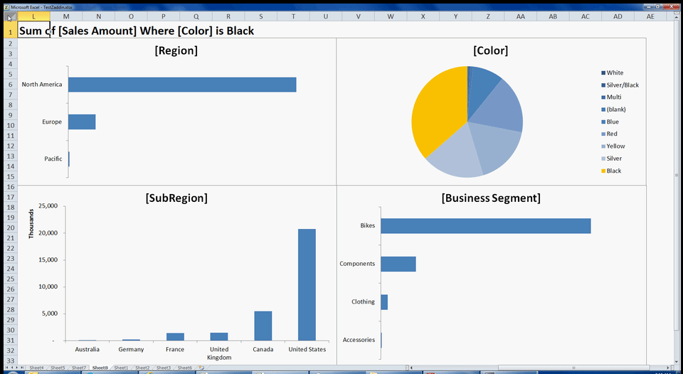
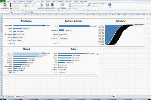
Interactive bar charts would be created for the categories you chose showing the Aggregated Data field for each category.
Click any bar or slice in a chart, all other charts would react to your selection and would automatically be 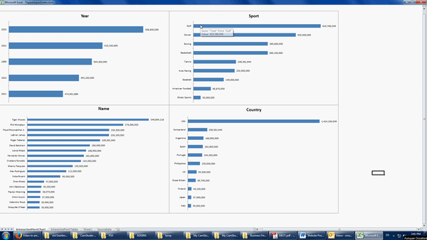 filtered by your selection.
Use “SHIFT” key on your Keyboard to select multiple items in chart
To deselect, click empty space in the chart i.e. click the chart area
3) Modifying/ Formatting Charts
Once you have created the interactive bar charts, you might want to
- Change chart type for some or all charts
- Add data labels, increase chart size
- Etc
To do this, go back to the “Z-Tools” tab and press “Stop Chart Interaction”. Now you can do your desired formattings and changes.
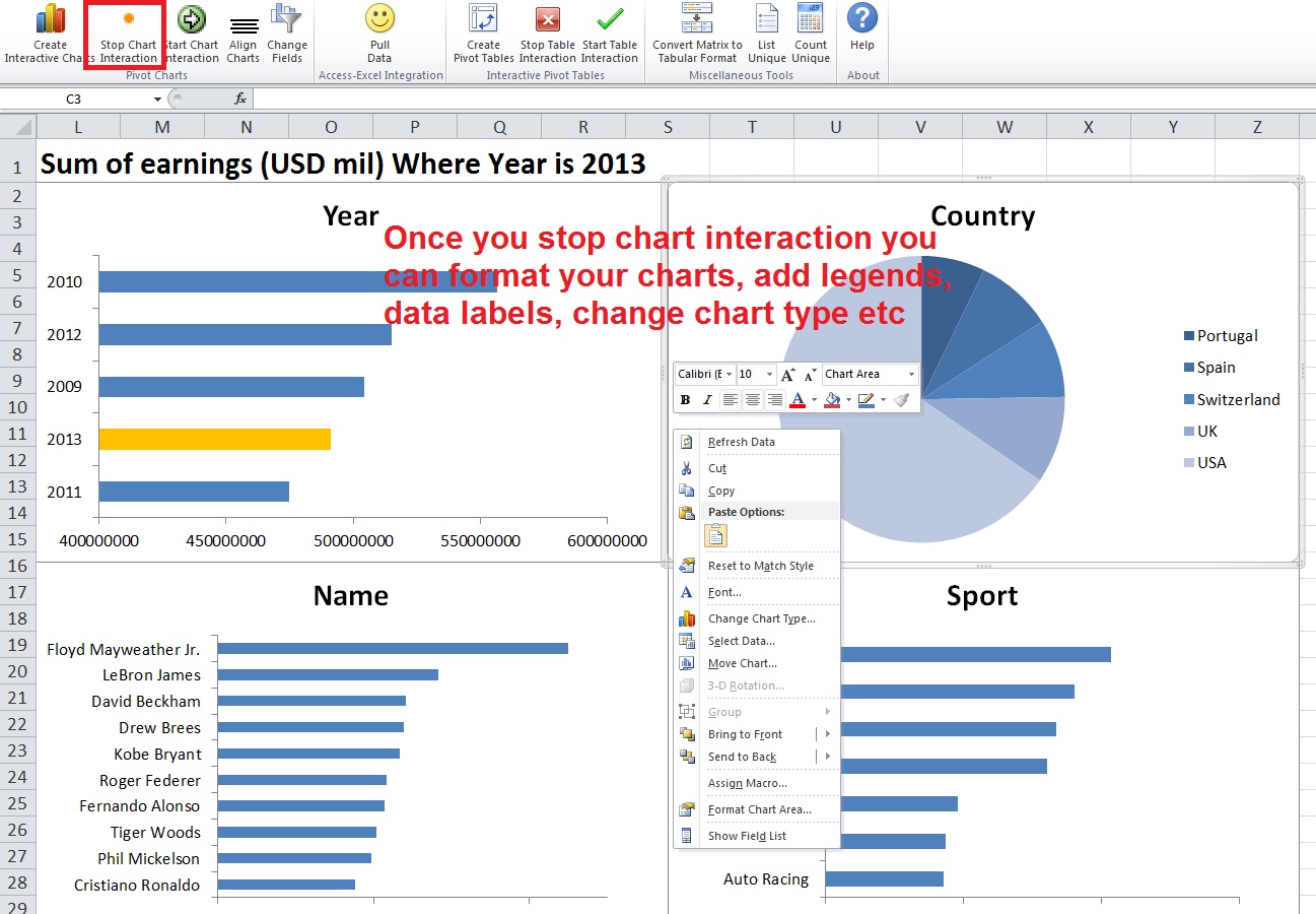
Once you are done with your changes, you can resume interactivity by pressing “Start Interaction” on the same tab.
4) GROUP DATES
You can Group the chart for “Date” Fields by months, quarters or years as follows
Stop chart interaction if it is activated. Then select the “Chart” with “Date” Field.
Go to Z-Tools tab>>> Go to Chart Options>>>Group Dates >>> Group dates by Months, Years or Quarters
This is illustrated in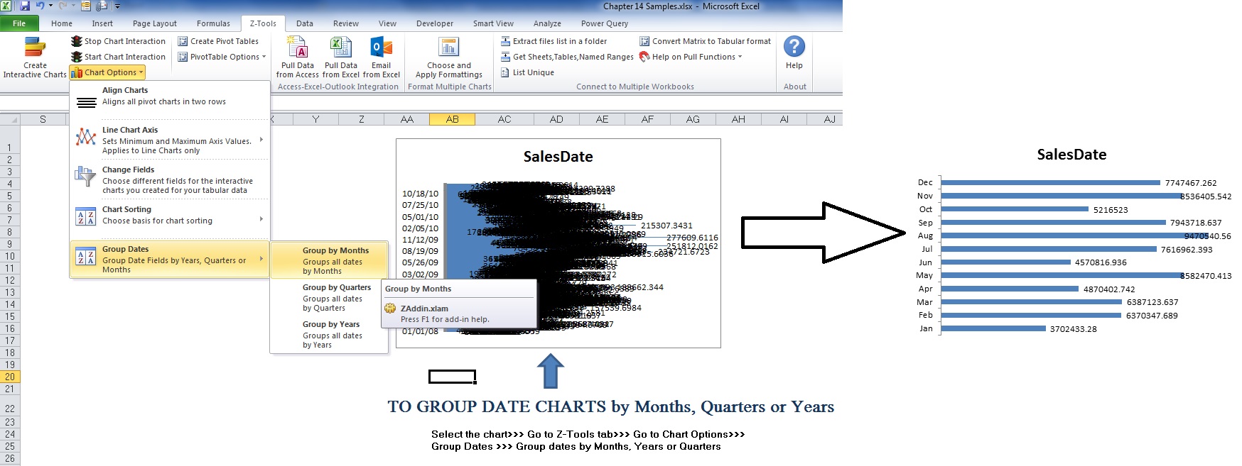 image below
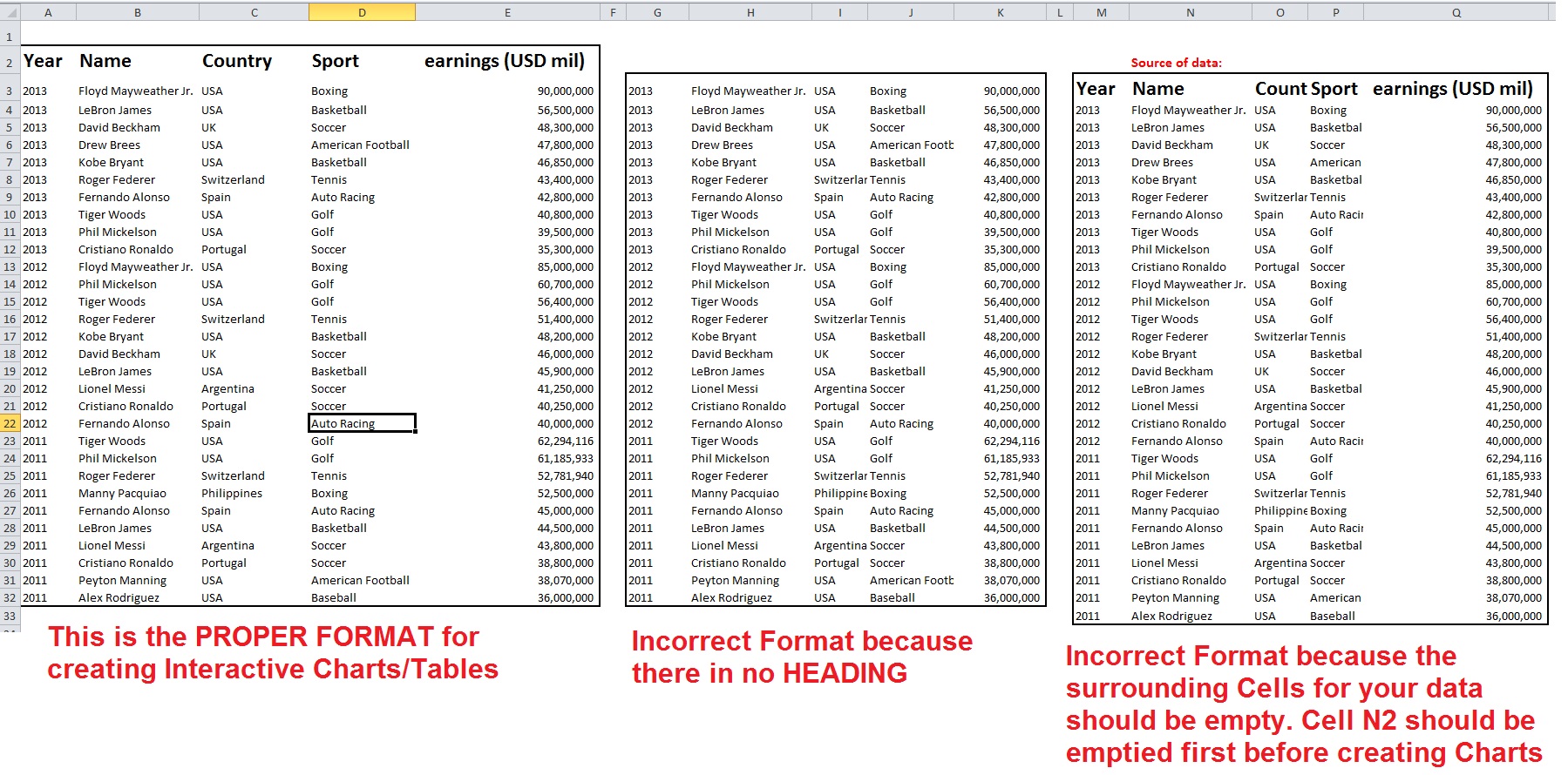
NOTE:
1) This Addin uses the CURRENT REGION feature of EXCEL to select the source data range. This has one important implication i.e. your data surroundings need to be empty
2) Your tabular data must contain HEADINGs for the Addin to function properly
The picture below summarizes this